Campus EALDE. Redesign of the student portal
Client
EALDE Business School
Timeline
January-March 2025
Skills
Web Design
UX/UI
Tools
Figma
Adobe Suite
Salesforce Digital Experiences
Overview
EALDE Business School is a 100% online business school with students from many different countries and a wide variety of digital profiles. Its student portal was intended to be the central hub for managing all academic matters, but in practice nobody used it for that purpose.
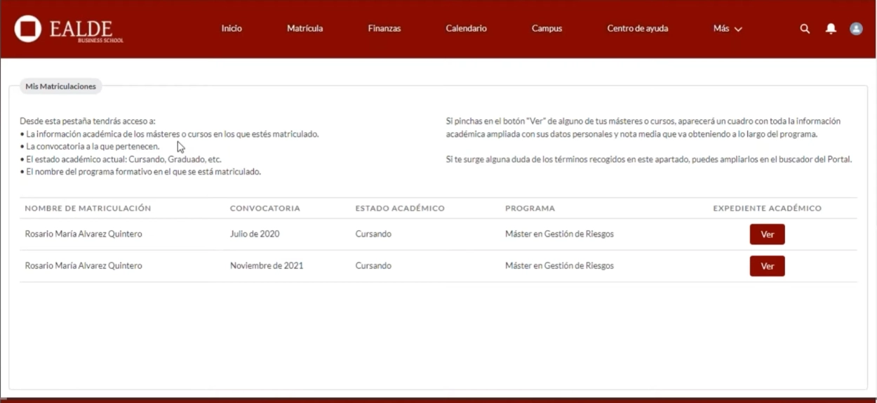
How did the campus look like back then
Before the redesign, the portal menu had grown organically over several years, accumulating sections without a clear underlying logic. Here's what students were navigating before any changes were made:
Discoveries
Before proposing any changes, I wanted to understand why students were avoiding the portal in the first place and why they kept turning to the support team instead.
I started by reviewing the existing portal structure, looking at the most common student requests, and talking to the support staff who dealt with users every day. They had a clear picture of where things were breaking down.
A pattern quickly emerged. Students weren't confused by the content itself, they just couldn't find where to do things.
The portal had grown organically over the years, and it showed. Navigation had been shaped by internal org structures rather than the way students actually thought about their tasks, which made even straightforward actions surprisingly hard to locate.
The result? Students were routinely skipping the portal entirely and calling support for things they should have been able to handle on their own — downloading certificates, pulling up documentation, checking their academic records.
That research phase brought the real problem into focus: it wasn't a matter of missing features. The portal had what students needed, it just wasn't organised in a way that matched how they expected to find it.
User persona
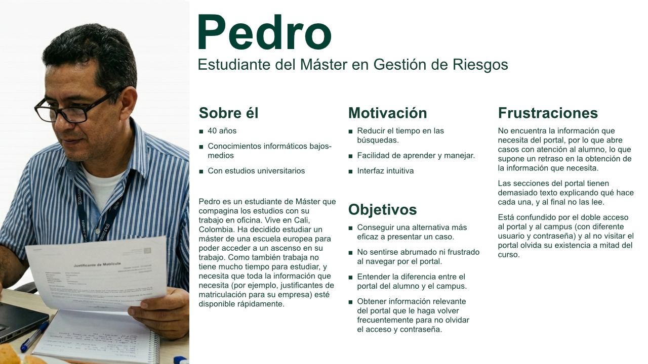
To ground the redesign in real student behaviour rather than assumptions, I built a persona based on actual student data — using the mode rather than the average, to represent the most common student profile rather than a statistical blend that might not reflect anyone real.
Findings
Based on what the research surfaced, I defined three lines of action to restructure the portal around student needs:
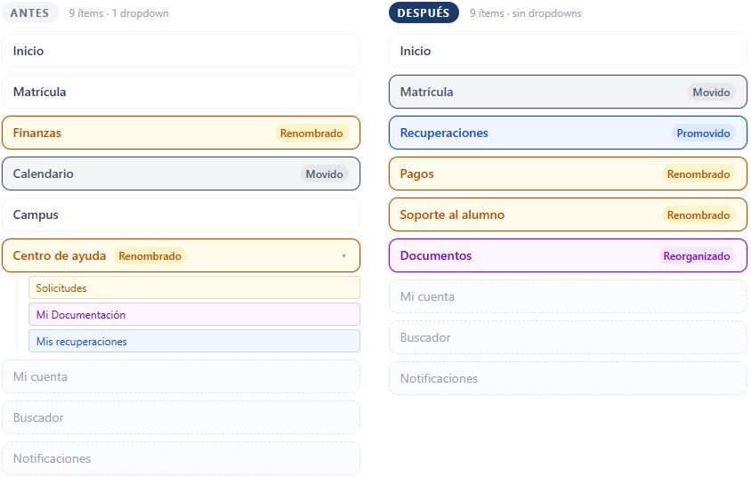
1. Reorganisation of the information architecture. I grouped the content into sections with a clear, task-oriented logic: what do I need to view, what do I need to manage, what do I need to download. Each section has a single, recognisable purpose.
2. Reducing the steps required to download documentation. One of the most frequent uses of the portal is the downloading of certificates and academic documents. I mapped out the entire workflow and identified unnecessary steps, reducing it to the minimum possible friction.
3. Simplifying navigation. I reduced the number of options visible in the main menu and established a clear hierarchy between primary and secondary sections, removing any ambiguity about where things were located.
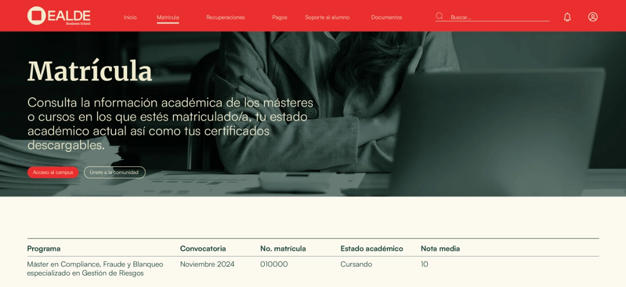
The redesign also coincided with a change in EALDE’s visual identity, which allowed the campus’s aesthetics to be refreshed in a manner consistent with the new brand.
Reducing friction: document downloads
One of the most frequent student tasks — and one of the main drivers of unnecessary support requests — was downloading academic documents such as certificates and transcripts.
The original navigation offered no clear path to find them. Documents were buried within a structure organised around internal logic rather than student needs, forcing users to search across multiple sections without clear guidance. The majority abandoned the process and contacted the support team directly.
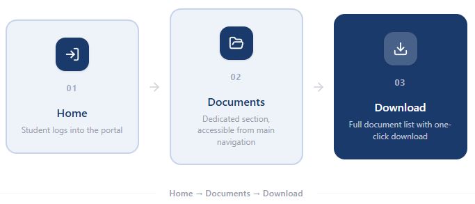
The redesign reduced the entire flow to three steps:
Home → Documents → Download
A task that previously required navigating an unclear menu structure now has a dedicated, clearly labelled section accessible from the home screen, with documents listed and available to download in one click.
Wireframe
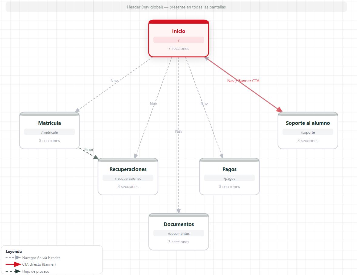
Before moving into high-fidelity design, I mapped out the new structure as a wireframe to validate the navigation and content hierarchy independently of visual styling. (The wireframe shown here has been reconstructed to reflect the original, as the source file was no longer available.)
Results
The redesign transformed the portal from a secondary resource into the primary destination for academic administration.
Students could now locate and download documentation without assistance, while key administrative tasks became easier to understand and complete thanks to a clearer information architecture and simplified navigation.
The project also established a more scalable structure for future platform growth and aligned the portal with EALDE's new visual identity.
The work on user experience at EALDE was recognised with the Digit E-learning 2025 Award for Best User Experience (UX), one of the leading accolades in the e-learning sector in Spain.
You can explore the interactive prototype here:
Learnings
This project reinforced something I keep coming back to in my work: information architecture can have a greater impact on user experience than visual redesign alone. Students didn't need a prettier portal, they needed to stop guessing.
It also taught me to value constraints. Working within an existing platform (Salesforce Digital Experiences) and an ongoing brand transition meant the real skill wasn't designing from a blank page, but finding the clearest possible structure within what was already there.
If I were to revisit this project today, I'd push to get a usability test in front of real students before finalising the new navigation, something the original timeline didn't allow for, but which I now build into every project from the start.